本文共 10422 字,大约阅读时间需要 34 分钟。
FusionCharts Suite XT统计图表使用笔记(2)--创建图表过程步骤
Let us build our first chart using FusionCharts Suite XT! Throughout this documentation, we will create charts for a fictional supermarket, Harry’s SuperMart, so that Harry, the owner of the supermarket, can make more sense of the data captured at various touchpoints in his supermarket. This data, when processed and presented effectively, can give Harry actionable insights for effective decision-making.
让我们使用FusionCharts Suite XT来创建我们的第一个图表吧! 通过这篇文档,我们将创建一个虚构的超市统计图表,Harry的超市,因此Harry是超市的拥有者,他可以从不同的切入点获取更有意义的数据。当这些数据被更有效的处理和呈现后,将给Harry更有效的决策和建议的参考。
(文档很简单,不再详细翻译了,看完这篇文档你就会用fusioncharts了)
Let’s start with a simple “Monthly revenue” chart, which we will plot in a Column 2D chart. Once done, it should look as under:
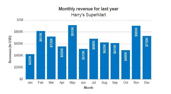
| Month | Revenue |
|---|---|
| January | $420,000 |
| February | $810,000 |
| March | $720,000 |
| April | $550,000 |
| May | $910,000 |
| June | $510,000 |
| July | $680,000 |
| August | $620,000 |
| September | $610,000 |
| October | $490,000 |
| November | $900,000 |
| December | $730,000 |
Let’s Begin
Let’s now get to building the chart. There are 5 simple steps to building a chart using FusionCharts Suite XT:
- Installing FusionCharts Suite XT for your application
- Converting your data to a JSON or XML format. FusionCharts Suite XT accepts both data formats, and can read it as a string, or from a file, local or remote
- Including the FusionCharts Suite XT JavaScript library in your HTML page
- Creating a container
<div>for the chart - Using the new
FusionCharts()constructor to create the chart instance, and then calling therender()method
Installing FusionCharts Suite XT for your application
To check whether you have FusionCharts Suite XT installed for your web application, as detailed , check for the following files in yourfusioncharts folder:
-
fusioncharts.charts.js -
fusioncharts.js -
fusioncharts.powercharts.js -
fusioncharts.gantt.js -
fusioncharts.maps.js -
fusioncharts.widgets.js
Basic charts like the Column 2D chart that we build in this example however, require only the fusioncharts.charts.js andfusioncharts.js files to be accessible on your web server.
Converting your tabular data to FusionCharts Suite XT JSON/XML format
FusionCharts Suite XT JavaScript library accepts data in JSON or XML format only. The data could be provided as JSON/XML strings, or they could be present as physical files on your servers. If you have your data stored in database or other data sources, you can write server-side scripts to read that data, iterate through it, and use strings to generate the XML or JSON data.
For this example, the tabular data above, when converted to FusionCharts Suite XT JSON/XML format, looks as under:
JSON格式的数据:
{ "chart": { "caption": "Monthly revenue for last year", "subCaption": "Harry's SuperMart", "xAxisName": "Month", "yAxisName": "Revenues (In USD)", "numberPrefix": "$", "theme": "fint" }, "data": [ { "label": "Jan", "value": "420000" }, { "label": "Feb", "value": "810000" }, { "label": "Mar", "value": "720000" }, { "label": "Apr", "value": "550000" }, { "label": "May", "value": "910000" }, { "label": "Jun", "value": "510000" }, { "label": "Jul", "value": "680000" }, { "label": "Aug", "value": "620000" }, { "label": "Sep", "value": "610000" }, { "label": "Oct", "value": "490000" }, { "label": "Nov", "value": "900000" }, { "label": "Dec", "value": "730000" } ]} XML格式的数据: Including FusionCharts Suite XT library in your page
To include the FusionCharts Suite XT JavaScript library in your HTML page, you use the <script> tag as under. Next, we include a theme file to style the chart. The theme is called fint (FusionCharts internal) and it is present in themes folder of your download.
If you have to generate maps, you will need to include other files in your page, as we will see in the later sections.
My first chart using FusionCharts Suite XT Creating a container for your chart in the web page
Each chart in the page needs a container to reside in. A <div> element works well as a container for the chart, as defined below.
FusionCharts XT will load here! It is important to specify a unique ID for this <div> container within the web page, as this ID is used in the chart initialization code to refer to this container.
Creating an instance of the chart
The final step is to create an instance of the chart type as column2d, set the width and height (in pixels or %), and finally specify the JSON data for the chart either as string or URL.
The following code does the trick.
FusionCharts.ready(function(){ var revenueChart = new FusionCharts({ "type": "column2d", "renderAt": "chartContainer", "width": "500", "height": "300", "dataFormat": "json", "dataSource": { "chart": { "caption": "Monthly revenue for last year", "subCaption": "Harry's SuperMart", "xAxisName": "Month", "yAxisName": "Revenues (In USD)", "theme": "fint" }, "data": [ { "label": "Jan", "value": "420000" }, { "label": "Feb", "value": "810000" }, { "label": "Mar", "value": "720000" }, { "label": "Apr", "value": "550000" }, { "label": "May", "value": "910000" }, { "label": "Jun", "value": "510000" }, { "label": "Jul", "value": "680000" }, { "label": "Aug", "value": "620000" }, { "label": "Sep", "value": "610000" }, { "label": "Oct", "value": "490000" }, { "label": "Nov", "value": "900000" }, { "label": "Dec", "value": "730000" } ] } }); revenueChart.render();}) In the above code:
-
We have created an instance of the
FusionChartsobject in therevenueChartvariable. Each chart or gauge in your HTML page needs to have a separate variable. The initialization code is wrapped within theFusionCharts.readymethod. This safeguards your chart instantiation code from being called before the FusionCharts Suite XT library is loaded and is ready to be used on the page. -
Next, we created an instance of the
column2dchart. Each chart type in FusionCharts Suite XT has a unique alias, using which you can create instance of that chart. In this case, we are creating an instance of a Column 2D chart with dimensions of 500x300 pixels, and providing JSON data as a string. -
To specify the data format as JSON, we set the
dataFormatparameter tojson. If you provided data to the chart in XML format, as explained in a later section, the value of this attribute would bexml. -
The actual JSON data is embedded as string as value of the
dataSourceparameter. Thechartobject contains a list of key-value pairs that let you configure the functional and cosmetic attributes of your chart. For example, the chart caption is set using"caption":"Harry's SuperMart". Each row of the tabular data is present within thedataarray, with name of month with key aslabel, and revenue with key asvalue. -
If you noted, we have used the
themeattribute in the chart’s JSON data and providedfint(FusionCharts Suite XT Internal theme) as the value for it. Themes let you centralize your cosmetic and functional properties across various charts in your web application. FusionCharts Suite XT is shipped with three default themes -ocean,zuneandcarbon. You can also create your own themes, as detailed in a later section. -
Call the
rendermethod to draw the chart in the chartContainer defined using the<div>element.
Thats it! You just created your first interactive JavaScript chart using FusionCharts Suite XT.
The full HTML code for the example looks as under:
My first chart using FusionCharts Suite XT FusionCharts XT will load here!
When you now view the page in a browser, you should see an interactive Column 2D chart, showing monthly revenues for Harry’s SuperMart similar to the live chart at the top of this page. Try rolling over the columns to see the tooltips, or refresh the page to see the chart animating again.
The best part about this chart is that it provides the same experience across mobile devices like iPhones, iPads, Android devices, and older browsers like IE6, including all the interactivity. FusionCharts Suite XT does all the hard work for you, so that you can focus on building your application!
Was there a problem rendering the chart?
In case something went wrong and you are unable to see the chart, check for the following:
-
If you are getting a JavaScript error on your page, check your browser console for the exact error and fix accordingly.
-
If the chart does not show up at all, but there are no JavaScript errors, check if the FusionCharts Suite XT JavaScript library has loaded correctly. You can use developer tools within your browser to see if
fusioncharts.jswas loaded. Check if the path tofusioncharts.jsfile is correct, and whether the file exists in that location. -
If you get a Loading Data or Error in loading data message, check whether your JSON data structure is correct, and there are no conflicts related to quotation marks in your code.
Click here for more information on .
Now that Harry can monitor his monthly revenues using this interactive chart, let’s build a gauge to show him the customer satisfaction score in the next section.